Google Trends confuses a lot of people, and almost always in the same few ways. The page looks stuck and will not update. The numbers change between visits. Two keywords look neck and neck when you know one is far bigger than the other.
None of that means Trends is broken. Most of it is Google Trends working exactly as designed, and you are simply reading it for something it was never built to show.
Here is what is really going on, point by point, and how to read the chart correctly.
Why Google Trends is not updating (and why the data keeps changing)
This is the most common complaint, and it covers two things that feel like bugs but usually are not: a page that will not refresh, and numbers that change every time you look. Here is why each happens.
- Trends is not live. The most recent few days are provisional estimates, and Google revises them as more data lands. So the same chart can look different a day later. That is a correction, not a glitch.
- It is built from a sample. Google Trends measures a sample of all Google searches, not every single one, and it can draw a fresh sample each time. Two lookups minutes apart can differ slightly for exactly this reason.
- The 0 to 100 scale is relative. Change the date range, country or category and every point on the chart is recalculated against a new high point. The line moves because it has been re-scaled, not because the underlying searches changed.
- Trending searches updates on its own schedule. The "Trending Now" page is specific to one country and refreshes on Google's clock, not yours. A tab you left open will not update itself, so reload the page, and check you are looking at the right country.
- Google moves things around. Google reorganises the Trends interface from time to time, so an old bookmark or an embedded chart can quietly stop working. Open trends.google.com fresh rather than through a saved link.
- A flat or empty chart usually means low volume. If there are not enough searches for a term in your range and region, Trends has nothing to plot. That is a "too little data" message, not an outage.
Still looks wrong? Hard-reload the page, try an incognito window, pause any ad blocker or privacy extension, and confirm your country and date range. Almost every "not updating" or "different results every time" report comes down to one of the points above. They all sit on Google's side, so no browser extension, ours included, can change how often Trends refreshes, but they do explain what you are seeing.
Is Google Trends accurate?
Yes, but only for what it actually measures. Google Trends is an accurate picture of relative interest: how a term's popularity rises and falls over time, drawn from a real sample of Google searches. As a gauge of momentum and seasonality it is reliable and genuinely useful.
Where it misleads people is when they read it as search volume. Trends never shows how many times a keyword was actually searched, only how each point compares to that keyword's own peak. It is also at its noisiest for low-volume terms and very short date ranges, where a single sample can swing the line. So "is Google Trends accurate?" really depends on the question you are asking it: spot on for trends, the wrong tool for volume.
What the 0 to 100 number actually means
Every Google Trends chart is normalized to a 0 to 100 index. Google takes the highest point in the range and region you picked, calls it 100, and scales every other point against it. So 50 means roughly half as popular as that peak, and 0 means there was too little data to register. Google's own data team explains the method here.
Two things follow from this, and they trip up almost everyone:
- The number is relative, not a count. A keyword at 100 is not "100 searches" or "100% of anything". It is simply this keyword's busiest moment in the period you chose.
- It is re-scaled for every view. Change the dates, the country or the comparison terms and the 100 mark can jump to a different point, so every other value shifts with it. This is the real answer to "why does Google Trends data change?".
That design is deliberate. Trends was built to surface the shape of demand and to compare trending keywords, while Google Keyword Planner is the tool built to compare actual search volumes. Problems start when you use one to do the other's job, which is exactly what the next example shows.
Interest is not the same as search volume
A quick example: Semrush vs Ahrefs
Let's compare two of the best-known SEO tools, Semrush (blue) and Ahrefs (red). Here is what Google Trends shows over the long run.
They look close, right? As interest, that is fair. But most people read this as search volume, and as a volume comparison it is misleading.
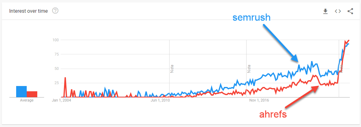
See this chart on Google Trends
Now here is the same comparison redrawn by estimated monthly search volume instead of relative interest.
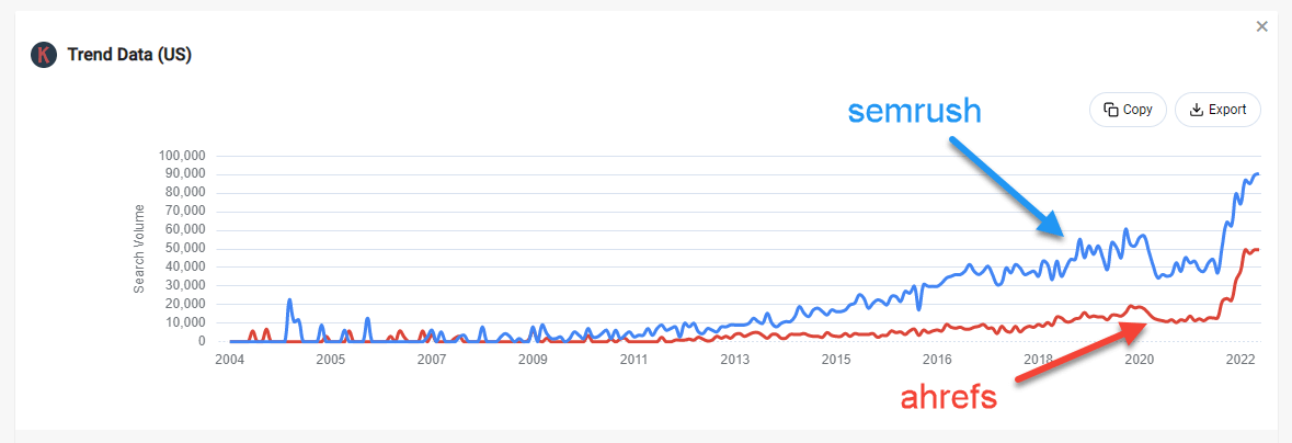
In this snapshot Semrush sat at around 689,000 searches a month globally, against roughly 32,700 for Ahrefs in Nov 2025, so the blue line sits well above the red one. Same two keywords, a very different picture, because one chart is interest and the other is volume.
Add a third keyword and it gets worse
Add Moz (yellow) to the mix and, on Google Trends, Moz looks like it is beating both of the others, at least in May 2025.
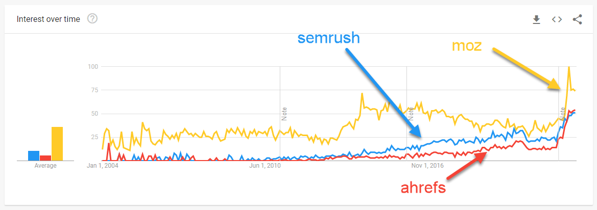
See this chart on Google Trends
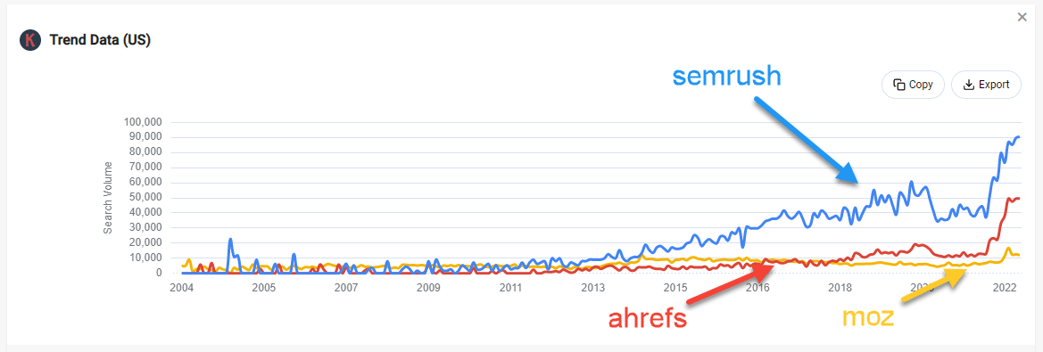
By search volume it is the opposite. Moz had far fewer searches, about 52,000 a month, than either of the other two.
How to see search volume on the Google Trends chart
Glad you asked! If the core problem is that Trends shows interest instead of volume, the fix is to put the volume back on the chart. That is exactly what Keywords Everywhere does.
Install the extension and it redraws the Google Trends chart scaled to the estimated monthly search volume, so the 0 to 100 index becomes numbers you can actually compare. The estimate is built from Google Keyword Planner data, the same source Google gives advertisers, scaled across the trend line, and every related query Google lists gets its search volume, CPC and competition alongside it. The "fixed" charts above are Keywords Everywhere doing exactly this.
Two things to know: the redrawn chart only appears for date ranges of 7 days or longer (there is not enough to scale a shorter window, so no chart is shown), and you can switch the whole feature off under Miscellaneous Settings on the extension's settings page.
Want the full breakdown of what the extension adds to Google Trends, including historical volume back to 2004? See the Google Trends search volume page.